CASE STUDY
LODHI ART FESTIVAL
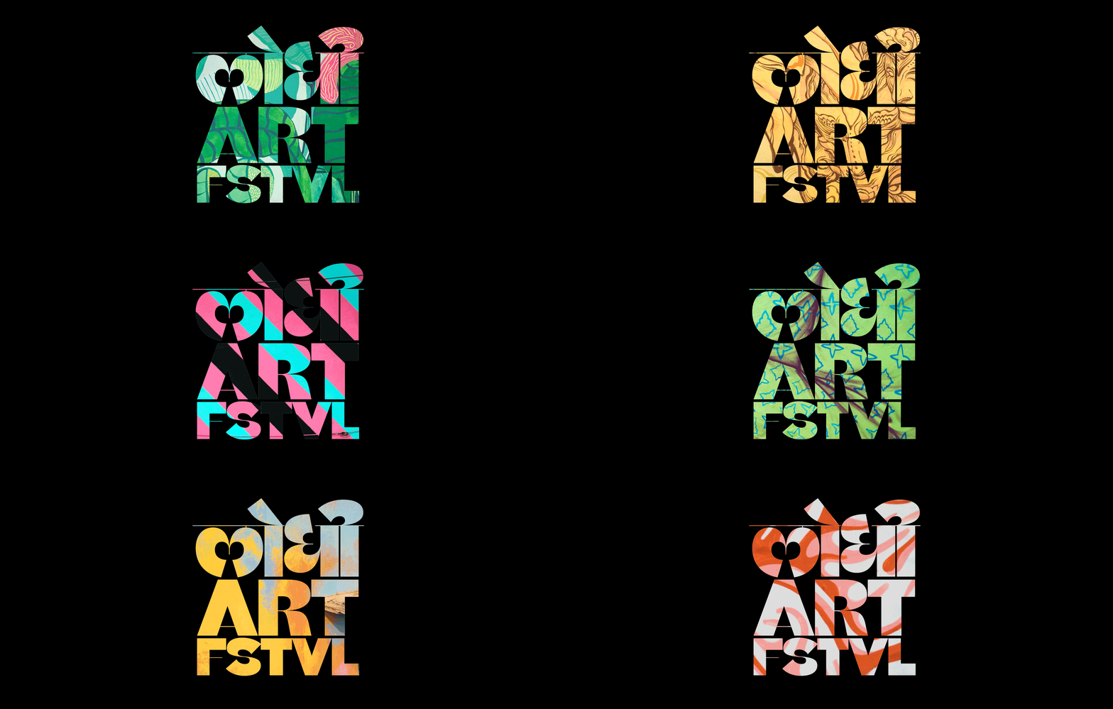
Visual Identity for a Street Art Festival and Gallery Exhibition called F(r)iction.
ABOUT ST+ART
St+art is a foundation promoting and creating public art projects through art districts, experiential exhibitions and installations contributing to urban regeneration and to community living across India.
Its aim is to make art accessible to a wider audience by taking it out of the conventional gallery space and embedding it within the cities we live in.Within its framework, the foundation also provides a platform for education and social awareness through a range of curated workshops, tours and community engagement activities.
ABOUT LODHI ART FESTIVAL
Lodhi Art Festival, curated by St+art was a street art festival featured 20 new murals, numerous workshops and performances. Located in Lodhi Colony, New Delhi. The festival also included a gallery exhibition,F(r)iction, in the same neighbourhood. It was an interactive experience exploring ever-changing relationship between art, technology and nature. It featured 20+ artists.
TEAM
Arjun Bahl (Director), Akshat Nauriyal (Media + Communication), Giulia Ambrogi (Curator), Hanif Kureshi (Artistic Director), Thanish Thomas (Project Director), Richa Kejriwal (Design Lead), Pranav Gohil ( Photography and Video), Avni Tandon (Programming and Outreach Partnerships), Manan Khurana (Press Relations), + Production Team (8 members) + Interns + Volunteers
DESIGN DIRECTION
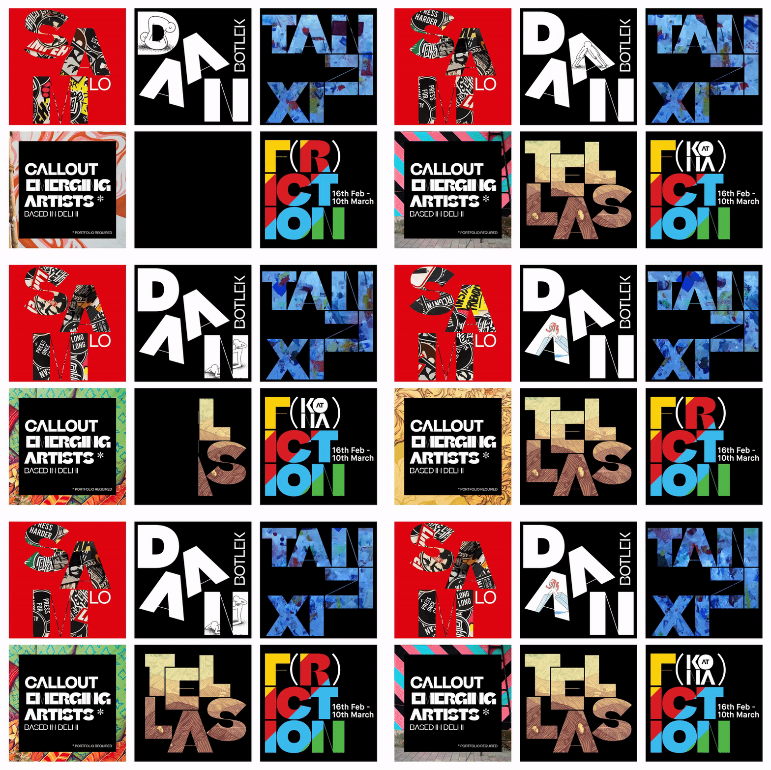
A bold engaging visual system that can span physical public spaces and adapt online.
Ensure it works with varied visual artwork yet have a distinct look for a wide audience.
SCOPE
Research and create image databank. Design templates that are easy to adapt. Manage maintain outgoing deliverables both internal and external.
CONSIDERATIONS
For consistency across many outreach and strategic partners, create a design system that was usable for non designers
To stay updated with evolving programming needs build easy to adapt systems.
Create design for many touch points like way-finding signage, merchandise and online ad campaign.
OUTCOME
A map of the art district, the exhibition layout, and the events calendar are carefully nestled into a foldable collectible. A walk down the history of the organization in newsprint. The print collaterals designed for this project is has been approached as information design in the form of a souvenir.
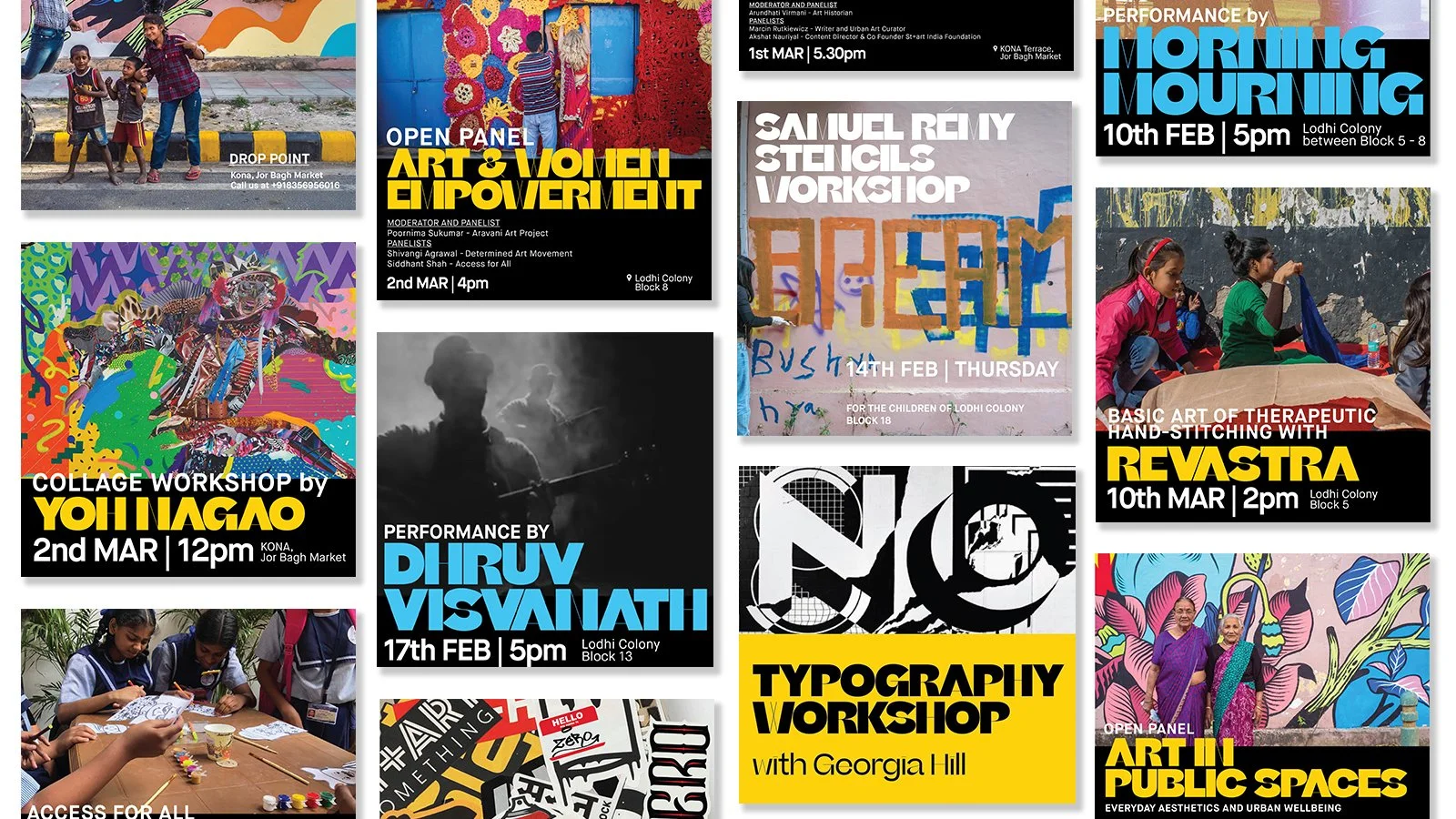
A visual system that combines motion, typography, and photography to introduce the audience to the festival and artists on showcase. With a focus on bold typography to emphasize each artist’s unique style and past work, design for social media was the first and central touchpoint for the festival’s communication strategy.
A series of exhibition collaterals for street workshops, way-finding, etc that complimented the artwork and was an extension of the visual system
KEY TAKEAWAYS
Scalable elements have a stronger impact.
Simplicity can be a distinct in itself
The system itself can be changed at any point and flexibility outweighs consistency.


