VISUAL IDENTITY, EXHIBITION DESIGN, WAY-FINDING, PRINT & DIGITAL
INDIA POP
‘India Pop’ was an exhibition featuring urban Indian artists through installations, interactive experiences, & performances. The identity designed for it combines traditional elements with a contemporary vision
Created to capture the essence of the art and the artists.
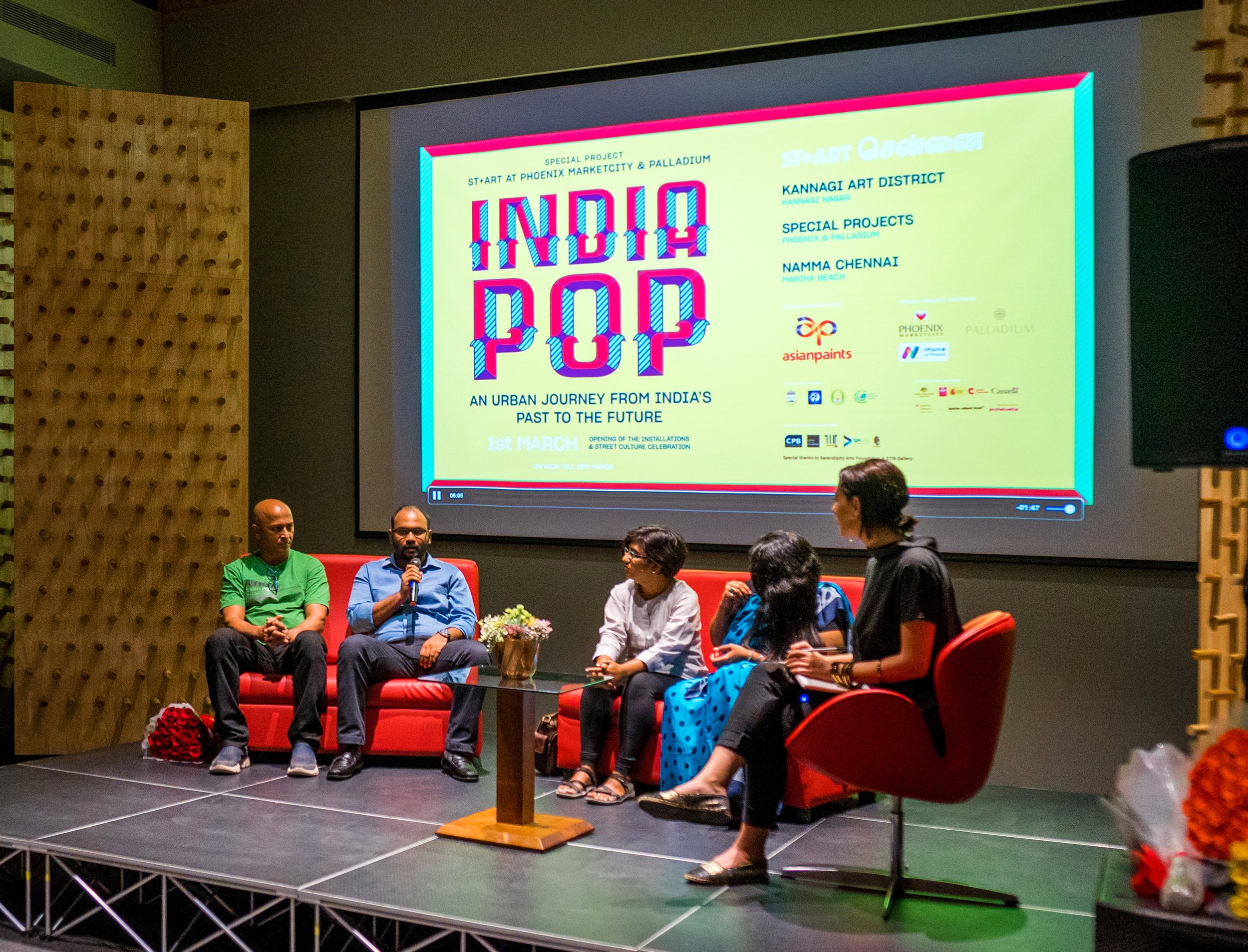
The identity was designed to create a seamless online and offline experience
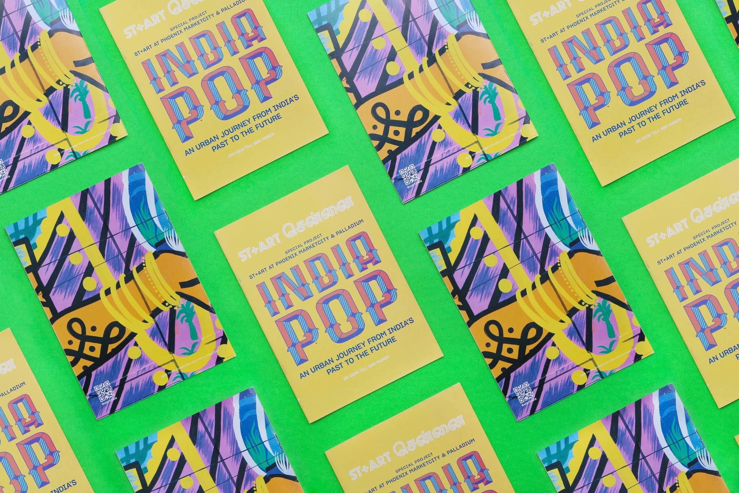
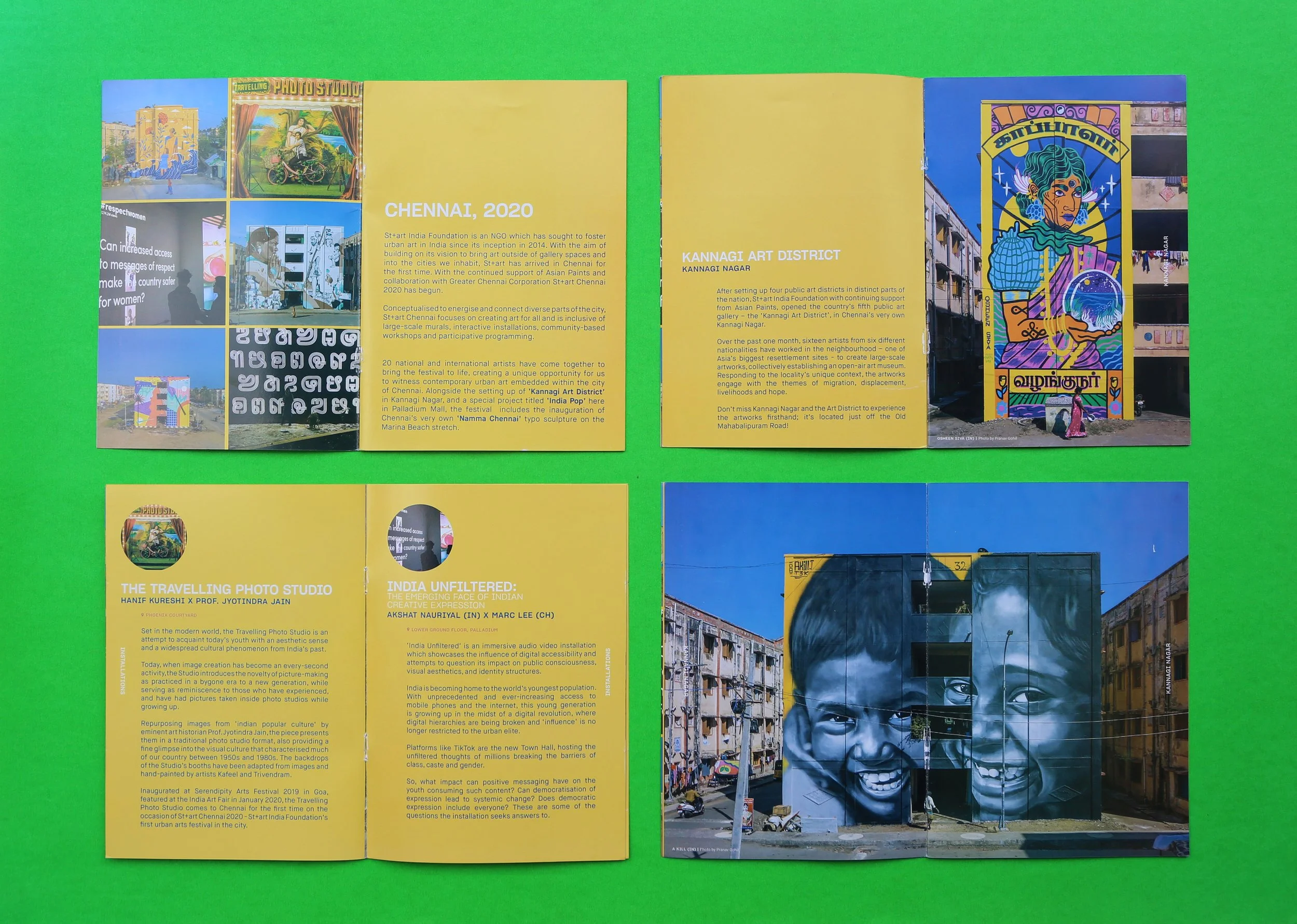
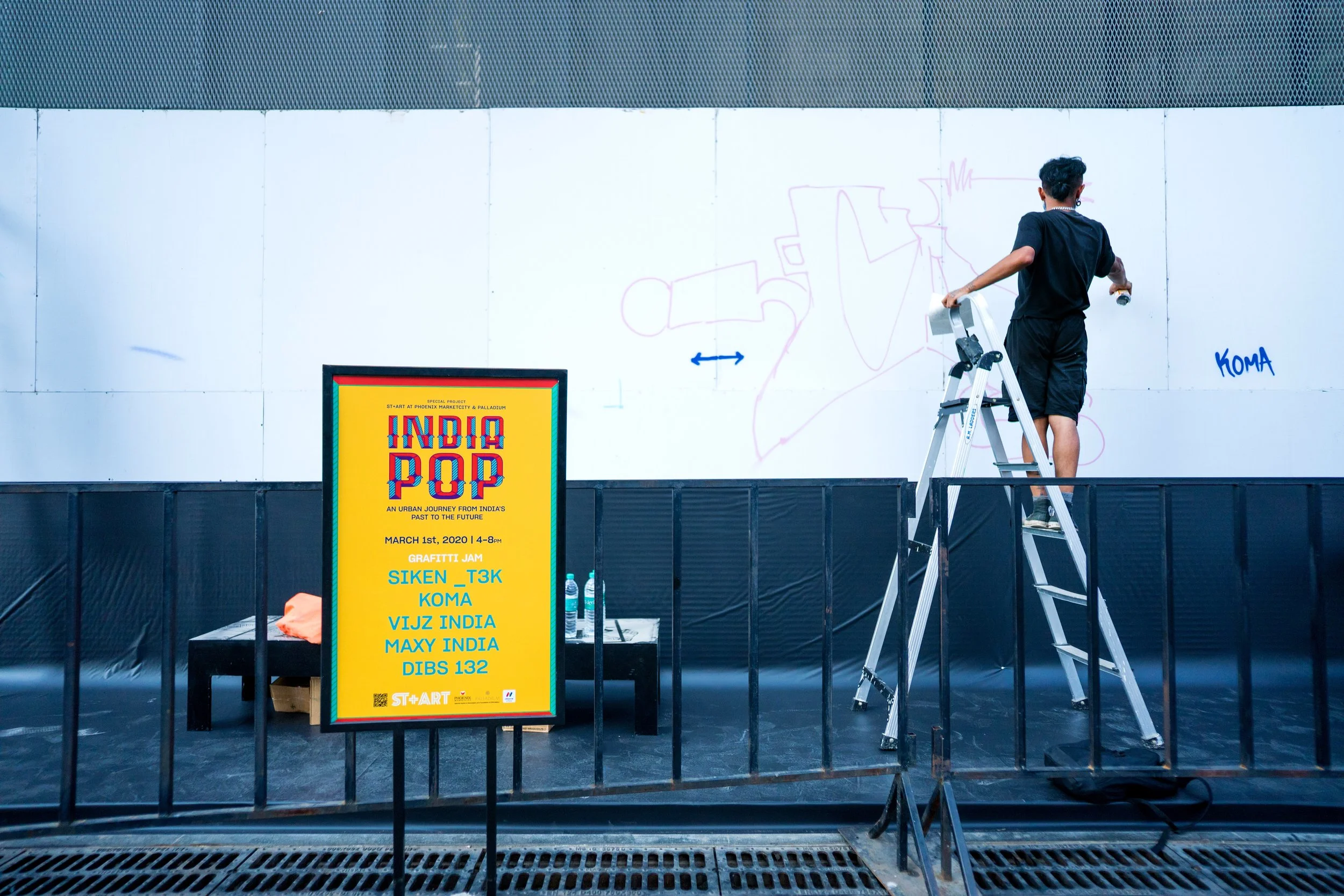
A blend of vibrant street art photography and minimal typography is used to build a design system that is sensitive to information hierarchy and can stand out in, an otherwise, visually noisy environment. Establishing a framework for an array of collaterals from pamphlets, signage, and display boards to social mediacampaigns.


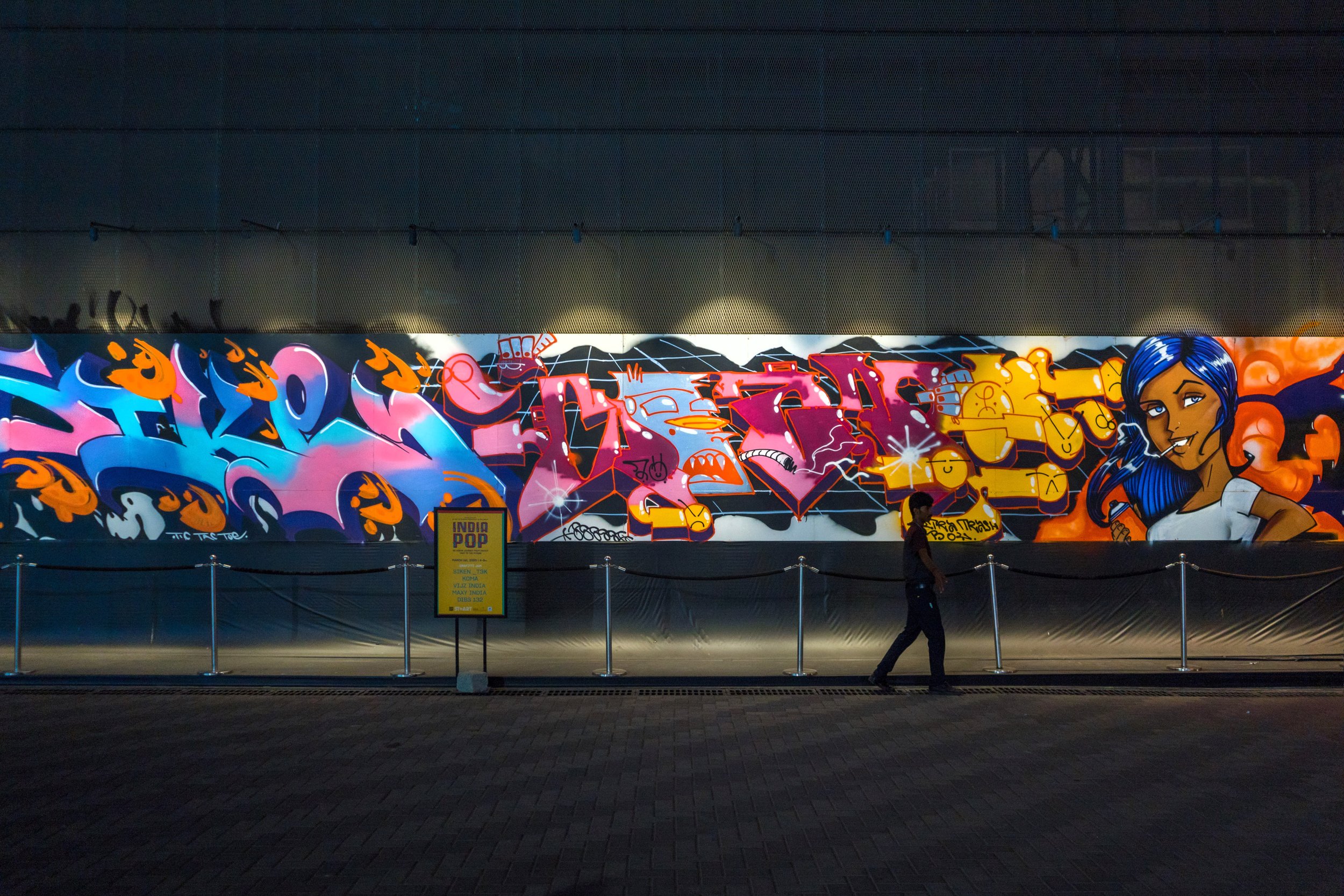
Design language elements like colors and typography are inspired by local textiles and street signage
The design for this exhibition is influenced by the vibrant murals created by artists in Kannagi Art District (Chennai). This exhibition was ongoing in parallel with events at the art district and was designed to create a synergy between the two spaces. The font used for ‘India Pop’ is a custom font ‘Painter Kafeel’. It is handpainted by Kafeel and digitized by Whitecrow. It attempts to revive a regional typeface and introduce it back into the design lexicon.
ABOUT THE PROJECT
2020, Made at St+art India Foundation. This brand identity was created for an exhibition ‘India Pop’ which was held at Phoenix Market City & Palladium, in Chennai (India). The exhibition was an extension of the Kannagi Art District also located in Chennai. 15 Indian & International Artists were invited to paint murals with the support of sponsors like Asian Paints. It was a collaborative initiative with Greater Chennai Corporation.

